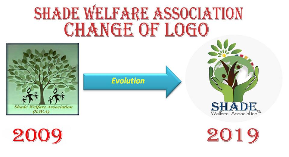
AnnouncementAfter ten years, we’re releasing an updated brand identity, which includes a new logo, colours, and font. You’ll see the new look anywhere we’re out in public, like our website, Facebook, and Twitter; very soon you’ll see it in all of our branding, as well. We believe the new look better matches what we’ve become since 2009: We are proud to announce the launch of the new logo as part of the ongoing evolution of the organization.
Since our founding in 2012, we’ve more or less stuck with the same spinning atom logo, although very recently we’ve slightly doctored our logo, the new logo reflects our vision, mission and works for the community development the colour included green associated of growth, harmony, , safety, and environment. The black colour is showing the sing of community strengthen, power and authority whereas yellow color is symbol of optimization and rising up new hopes. The hands in the picture are showing the protection of the rights of the human values, environment, peace, justice and environment and colour full of the rainbow is indicating the united nation SDG (Sustainable development Goals). |
|
News CLIPPING |
Shade Audit Report |
Shade Profile |
Shade Annual Report
| ||
Project Reports
|
| ||||||||
ADVERTISEMENT
Tender , News , EOI
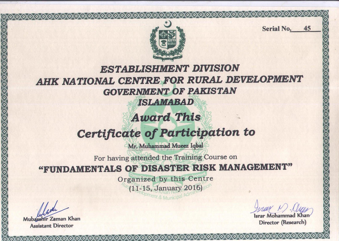
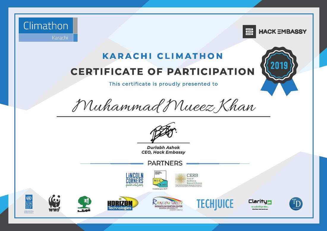
Other Publication & Certificate


Copyright 2022, All Rights Reserved by Shade Organization.
Designed By-The Moiz-i$m ©
Designed By-The Moiz-i$m ©
